Creating a summary pie or bar chart
To create a summary pie or bar chart for a scenario or DataView, you add an instance of the object to a dashboard and attach its valueTable property to a DataView or scenario instance table. When you define the attachment, you can select the variable to be charted as well as the label to be used for the data in the chart legend. As with table objects, when you define the data attachment, you can also supply a filter that specifies the subset of the instances that are charted.
Note that users can view only those scenario and DataView instances that they created. Regardless of filter settings, users will not be able to see instances they did not create.
To see a sample bar chart, double click Bar Chart on the tutorial main page.
To create a summary bar chart, create a new dashboard and perform the following steps.
1. From the Graphs tab in the object palette, select the Bar Graph object and add it to the dashboard canvas.
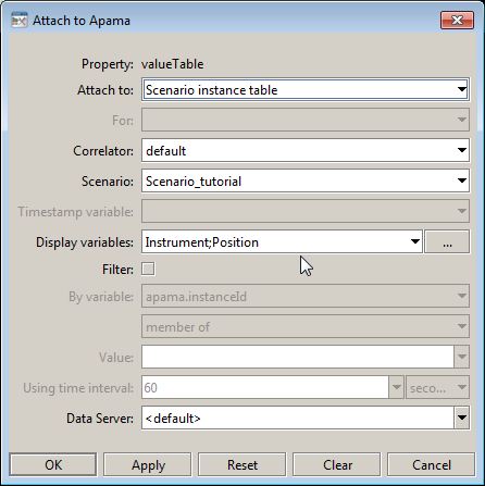
2. With the graph object selected, double click the valueTable property in the Object Properties panel, and attach the graph to a scenario.
3. Click OK.
The bar chart will now chart the value of Position for each instance of the scenario.
In this example the display variables were set to Instrument and Position. Instrument is a string variable and was included to provide a meaningful label for each bar in the chart legend.
For both bar and pie charts, you can pick a scenario string variable to use as the label in the legend. Do not pick a number variable as it will be interpreted as the value to chart.
If multiple number variables are selected for display the behavior is controlled by the rowSeriesFlag property as detailed in the following section.


