Using trend charts
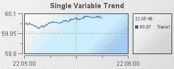
Trend charts provide the ability to view changes in a scenario variable or DataView field over time. The following illustration shows a typical trend chart:
In this sample, a single trend line is displayed to show the value of the Price variable of an instance of the tutorial scenario.
A trend chart can display up to ten trace lines allowing you to compare changes in up to ten scenario variables. Useful examples of trend charts might show the changes in price for two stocks or the movement of a single stock price relative to a market average.
The traces in a trend chart can be shown as lines or as individual data points.
1. Open the file tutorial-trend.rtv by selecting Trend Chart on the tutorial main page.
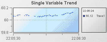
2. Select the trend chart and in the Object Properties panel select the property trace1MarkStyle and change its value to 1.
3. Select the property trace1LineStyle and change its value to 0.
The trace line in the trend chart will now be displayed as a series of points.
The data values displayed are the same; only the presentation has changed.
Common tasks related to trend charts are covered in the following sections:
Detailed reference information on trend charts is provided in
Trend graphs in the
Apama Dashboard Property Reference.
Copyright © 2013
Software AG, Darmstadt, Germany and/or Software AG USA Inc., Reston, VA, USA, and/or Terracotta Inc., San Francisco, CA, USA, and/or Software AG (Canada) Inc., Cambridge, Ontario, Canada, and/or, Software AG (UK) Ltd., Derby, United Kingdom, and/or Software A.G. (Israel) Ltd., Or-Yehuda, Israel and/or their licensors.