Sparkline charts
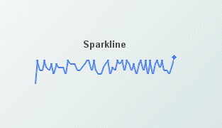
Sparkline charts are generally used to present trends and variations in a simple and condensed way. As the name implies there is a line associated with data, but no background or axis. It is possible to add labels at the beginning and ending points of the line, which then can be toggled on and off.
Attach scalar data to the value property or tabular data to the valueTable property. Tabular data attached to the valueTable property should have two columns: the first must contain numeric values or time stamps (x-axis values), and the second column should contain the corresponding (y-axis) numeric values.
When a sparkline chart is selected in the Builder canvas, the Object Class Name that appears at the top of the Object Properties pane is obj_sparkline.
The Object Properties panel organizes stock chart properties into the following groups:
Copyright © 2013
Software AG, Darmstadt, Germany and/or Software AG USA Inc., Reston, VA, USA, and/or Terracotta Inc., San Francisco, CA, USA, and/or Software AG (Canada) Inc., Cambridge, Ontario, Canada, and/or, Software AG (UK) Ltd., Derby, United Kingdom, and/or Software A.G. (Israel) Ltd., Or-Yehuda, Israel and/or their licensors.