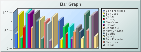
Bar graphs
Bar graphs visualize tabular data that has one or more numerical columns. Typically, the visualized data also has one non-numerical column, whose values are used as graph labels that uniquely identify each row.
A bar graph can visualize data in either of two ways:

Row series visualization: One group of bars is shown for each numeric column in the data attachment. Within each group, there is a bar for each row in the data attachment.

Column series visualization: one group of bars is shown for each row in your data attachment. Within each group, there is a bar for each numeric column in the data attachment.
Use the
valueTable property to attach data to a bar graph. Use the
rowSeriesFlag property to specify row series or column series visualization.
You can attach additional data to a bar graph by using the
traceValueTable property. Data attached to this property is visualized with plotted points, or
trace markers, rather than bars.
A bar graph can visualize trace data in either of two ways:

Row series visualization: One group of trace markers is shown for each numeric column in the data attachment. Within each group, there is a marker for each row in the data attachment.

Column series visualization: one group of trace markers is shown for each row in your data attachment. Within each group, there is a marker for each numeric column in the data attachment
The points within a group are connected to one another by a polyline, or trace line.
The current section covers the following kinds of bar graphs:
 Bar graph
 3-D Stacked bar graph
 Grouped bar graph with traces
These visualization objects all share the same properties. They differ from one another only with regard to their default values for these properties. When one of these objects is selected in the Builder canvas, the Object Class Name that appears at the top of the Object Properties pane is obj_bargraph.
The Object Properties panel organizes bar graph properties into the groups below.
