The TABSTRIP2 control is used to navigate through certain aspects of your application. The way you navigate depends completely on your implementation.
The following topics are covered below:
The control looks as follows:
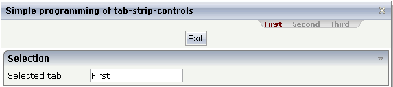
For each aspect, there is one tab holding a name and an index. The left-most tab holds index 1, the next one 2, etc.
DEFINE DATA PARAMETER
1 TABS
2 SELINDEX (I4)
2 TSITEMS (1:*)
3 NAME (U) DYNAMIC
END-DEFINE
value-of-tabstripprop.onSelect
| Basic | |||
| tabstripprop |
Name of the adapter parameter that represents the control in the adapter. |
Optional | |
| align |
Horizontal alignment of the control's content. |
Optional |
left center right |
| scrollable |
If set to "true" then small icons will appear on the right border of the control. If the size of the "tabs" is too big and some tabs are cut as consequence then you can use these icons for scrolling left and right. |
Optional |
true false |
| backgroundstyle |
CSS style definition that is directly passed into this control. With the style you can individually influence the rendering of the control. You can specify any style sheet expressions. Examples are: border: 1px solid #FF0000 background-color: #808080 You can combine expressions by appending and separating them with a semicolon. Sometimes it is useful to have a look into the generated HTML code in order to know where direct style definitions are applied. Press right mouse-button in your browser and select the "View source" or "View frame's source" function. |
Optional |
background-color: #FF0000 color: #0000FF font-weight: bold |
| comment |
Comment without any effect on rendering and behaviour. The comment is shown in the layout editor's tree view. |
Optional | |