The GOOGLEMAP2 control is used to provide for Google Maps support within Application Designer pages. The control internally makes use of the Google Maps API. In order to use the control on your site, you need to sign up for a Google Maps API key at http://code.google.com/apis/maps/signup.html. Make sure that you agree with the Google Maps API Terms of Use (http://code.google.com/apis/maps/terms.html).
The following topics are covered below:
In order to use the GOOGLEMAP2 control, you need to sign up for a Google Maps API key. A key is valid for a single "directory" on your web server only, i.e. you sign up for a URL like http://www.mysite.com/mywebapp/myproject. With a standard installation of Application Designer on localhost, you may sign up for the URL http://localhost:8080/mywebapp/myproject. Typically, you develop your Application Designer web application not on the site on which you run it later in productive mode. Therefore, you may sign up for two different sites (development and production site).
Choose the project directory that keeps the layouts using the GOOGLEMAP2 control.
Sign up for a Google Maps API key at http://code.google.com/apis/maps/signup.html for this project directory (e.g. http://localhost:8080/mywebapp/myproject).
Create the API key page. Store the key page in the registered project directory. You are free in naming the file (the file extension must be "html"). The GOOGLEMAP2 control embeds your API key as a subpage. The subpage must have the following minimum structure:
<html>
<head>
<script src=" http://maps.google.com/maps?file=api&v=2.x&key=YOUR_API_KEY"></script>
<script src="../HTMLBasedGUI/general/googlemapsscript.js"></script>
</head>
<body>
<div id="map" style="position:absolute; top0; left:0;"></div>
</body>
</html>
You see that the page includes two JavaScript libraries. The first
line refers to the Google Maps API. Replace the placeholder
"YOUR_API_KEY" with your Google Maps API key. With
the second line, the page includes the control's scripting (calls from Application Designer to
the Google Maps). The page body is quite simple: it contains a single
div tag with the ID
"map". This div is used
as an anchor to insert Google Maps controls dynamically.
The following topics are covered below:
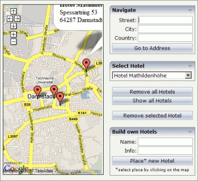
The map options are taken from the property
infoprop. On this object, you may set the address
(or latitude and longitude), the zoom level and the map size as well as the map
type.
Note:
The usage of address or longitude/latitude is mutually
exclusive.
The following topics are covered below:
Your Google Maps API key is bound to a directory on a certain web server (i.e. you sign up for the URL http://mycomputer.mydomain.com:8080/mywebapp/myproject). If you use your key for another URL, Google shows an error message:
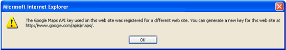
Reasons that cause the error:
You have registered your computer using the computer's name (e.g. http://mycomputer...). But the Application Designer development workplace is started using the URL http://localhost....
Solution: start the Application Designer workplace with http://mycomputer....
The registered directory (e.g. .../mywebapp/myproject) does not match your installation (either a mistake in writing when signing up for the key or you have renamed the web application or project after registration).
Solution: rename your web application or project to match the registered names. Or sign up for a new key and insert the new key into the API key page. In the latter case, delete the content of the browser's cache. Otherwise, the browser will use the former API key page (and thus the old key).
If you use longitude and latitude for placing the marker on the map, their values may exceed the map top (or bottom) border. If you are able to find the map by scrolling down (or up), then this is the case. Check the values for longitude and latitude in this case.
| Basic | |||
| infoprop |
Name of adapter parameter that represents the control in the adapter. |
Obligatory | |
| apikeypagename |
Name of the Maps API Key page. Example: mygooglemapsapikey.html. Keep this file within the project directory (directory within the CIS HTML pages are kept). The GOOGLEMAP-control expects this file within certain Javascript includes and content. Have look into chapter "Google Map - Before You Start" within the Developers Guide |
Obligatory | |
| width |
Width of the control. There are three possibilities to define the width: (A) You do not define a width at all. In this case the width of the control will either be a default width or - in case of container controls - it will follow the width that is occupied by its content. (B) Pixel sizing: just input a number value (e.g. "100"). (C) Percentage sizing: input a percantage value (e.g. "50%"). Pay attention: percentage sizing will only bring up correct results if the parent element of the control properly defines a width this control can reference. If you specify this control to have a width of 50% then the parent element (e.g. an ITR-row) may itself define a width of "100%". If the parent element does not specify a width then the rendering result may not represent what you expect. |
Optional |
100 120 140 160 180 200 50% 100% |
| height |
Height of the control. There are three possibilities to define the height: (A) You do not define a height at all. As consequence the control will be rendered with its default height. If the control is a container control (containing) other controls then the height of the control will follow the height of its content. (B) Pixel sizing: just input a number value (e.g. "20"). (C) Percentage sizing: input a percantage value (e.g. "50%"). Pay attention: percentage sizing will only bring up correct results if the parent element of the control properly defines a height this control can reference. If you specify this control to have a height of 50% then the parent element (e.g. an ITR-row) may itself define a height of "100%". If the parent element does not specify a width then the rendering result may not represent what you expect. |
Optional |
100 150 200 250 300 250 400 50% 100% |
| comment |
Comment without any effect on rendering and behaviour. The comment is shown in the layout editor's tree view. |
Optional | |
| Appearance | |||
| pagestyle |
CSS style definition that is directly passed into this control. With the style you can individually influence the rendering of the control. You can specify any style sheet expressions. Examples are: border: 1px solid #FF0000 background-color: #808080 You can combine expressions by appending and separating them with a semicolon. Sometimes it is useful to have a look into the generated HTML code in order to know where direct style definitions are applied. Press right mouse-button in your browser and select the "View source" or "View frame's source" function. |
Optional | |
| rowspan |
Row spanning of control. If you use TR table rows then you may sometimes want to control the number of rows your control occupies. By default it is "1" - but you may want to define the control two span over more than one columns. The property only makes sense in table rows that are snychronized within one container (i.e. TR, STR table rows). It does not make sense in ITR rows, because these rows are explicitly not synched. |
Optional |
1 2 3 4 5 50 int-value |
| colspan |
Column spanning of control. If you use TR table rows then you may sometimes want to control the number of columns your control occupies. By default it is "1" - but you may want to define the control to span over more than one columns. The property only makes sense in table rows that are snychronized within one container (i.e. TR, STR table rows). It does not make sense in ITR rows, because these rows are explicitly not synched. |
Optional |
1 2 3 4 5 50 int-value |